MakeMyTrip — Hotel Booking Experience
Platform evaluated:
Mobile app
Journey evaluated:
Hotel discovery → comparison → selection
Persona assumed:
Domestic, budget-conscious trips, solo and group travel (>4 pax), looking for hotels for 4 nights, 2 pax.
1. App Entry & Landing Experience (First Impression)
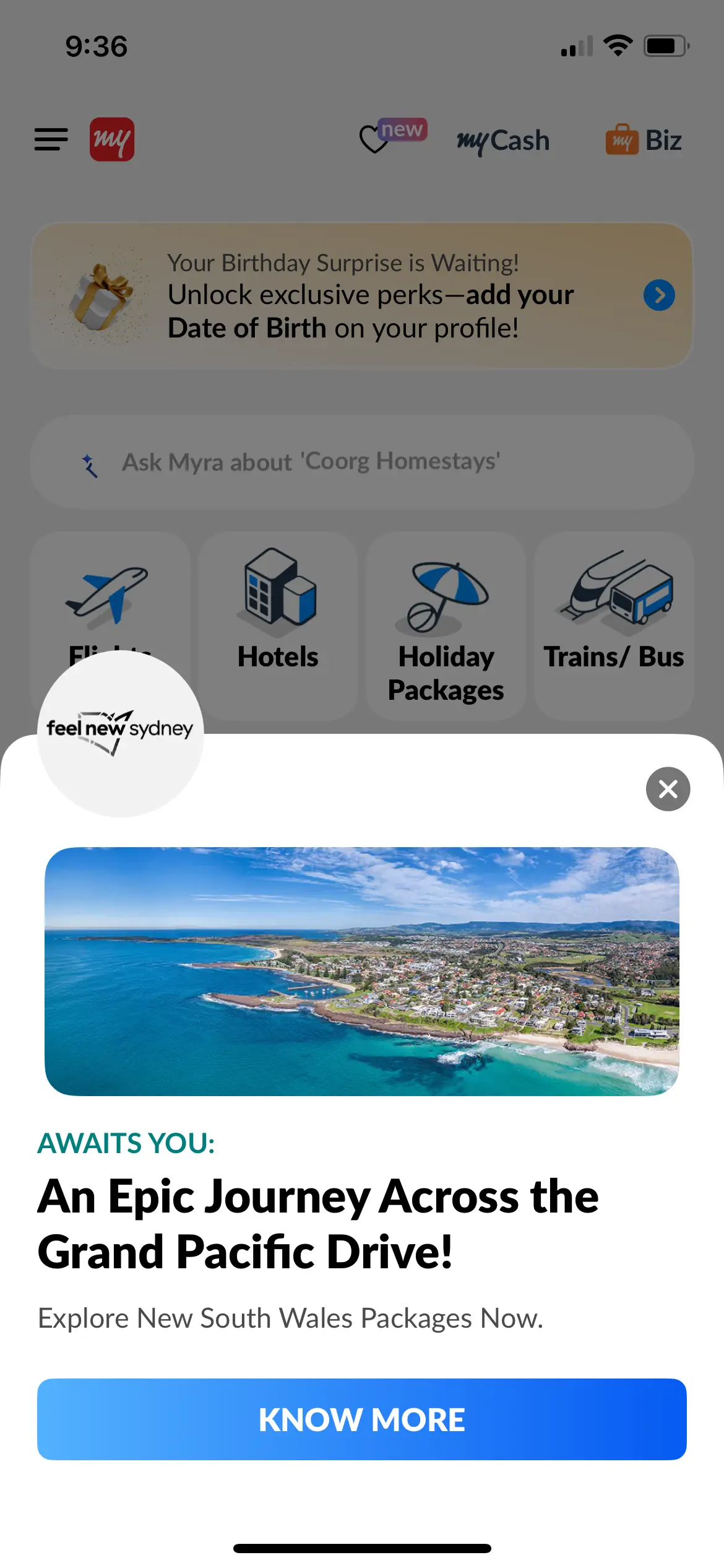
On app launch, MakeMyTrip (MMT) surfaces a promotional popup over the landing page.
The promotion shown was “New South Wales Packages”, despite historical usage being: domestic travel, budget-conscious stays, solo workations and large group travel (>4 pax)
Improvement Opportunity
In travel and hospitality, promotions are high-value entry points, especially in a price-sensitive market. However, the very first interaction is also the most intent-critical moment.
The lack of contextual personalization here creates a mismatch between user intent (likely hotel discovery), user history (domestic, economy trips) and the promotional content (international holiday packages).
The promotional messages, especially the ones that enjoy prime placement such as first interactions, should be customized to the user history, if cannot be avoided altogether.
Trade-off assessment
Broad campaign exposure > relevance to current user intent
This trade-off risks:
- Cognitive friction at the start of the journey
- Delayed access to core CTAs (Hotels, Search)
2. Landing Page Structure & Primary CTAs
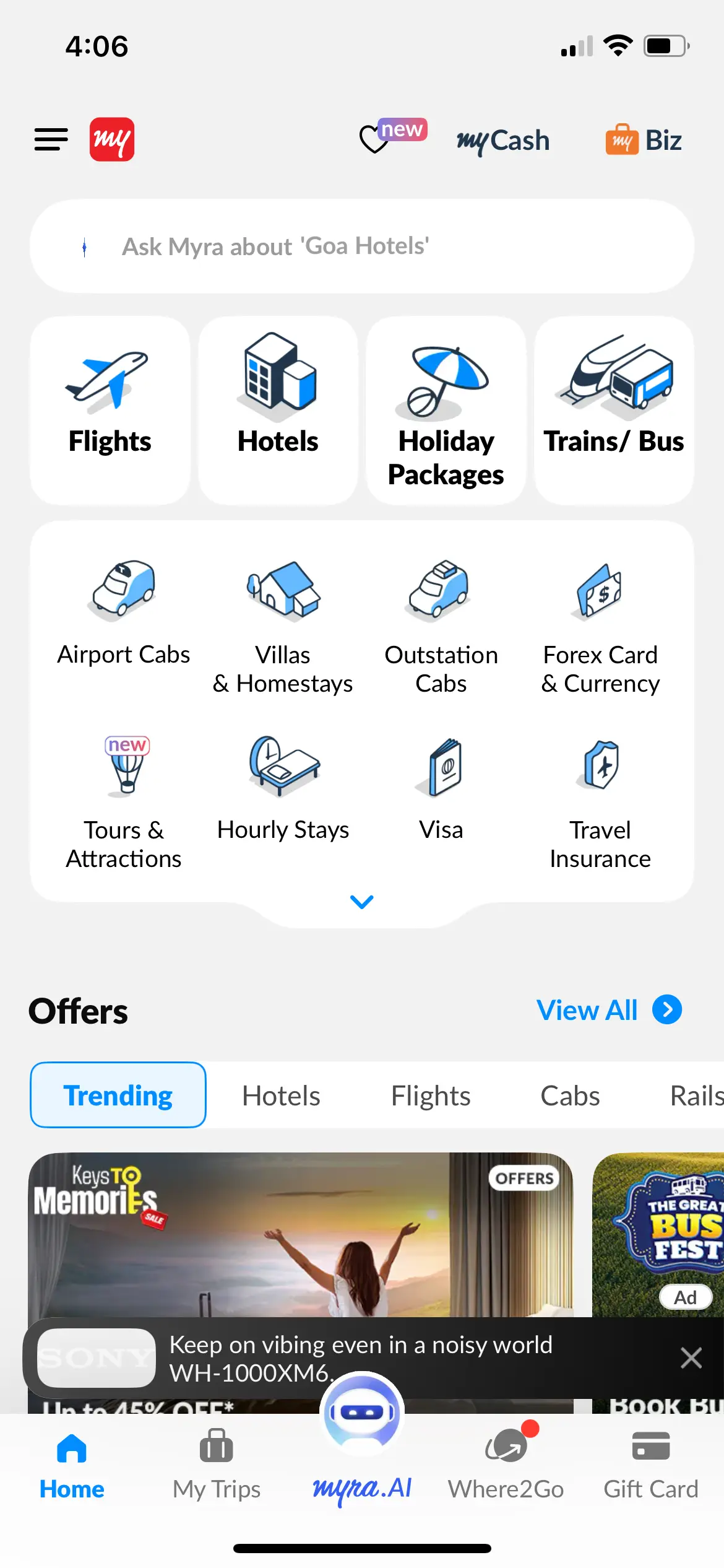
The landing page clearly presents primary service categories: Flights, Hotels, Holiday Packages, Trains / Bus. This is followed by secondary services: Airport Cabs, Villas & Homestays, Outstation Cabs, Forex, Visa, etc.
What works well
This hierarchy provides strong clarity and discoverability of MMT’s breadth.
Improvement opportunity
Currently, key travel intent inputs—location, dates, pax—are hidden behind service selection.
A more intent-forward design would:
- Surface ‘location, dates, pax’ input fields above or below the primary services
- Keep Hotels (or most popular category) as the default
This pattern is effectively used by Booking.com.
Why this matters-
- These three inputs are common across Flights, Hotels, Holiday Packages, Trains/Bus
- Reduces one step in the user journey
- Directly moves the user from intent → discovery
Trade-off assessment
UI real estate: Minimal (only 3 fields)
Journey benefit: Fewer taps, higher confidence, clearer mental model
This is a low-cost, high-impact optimization.
3. Discovery Page & Result Card Design
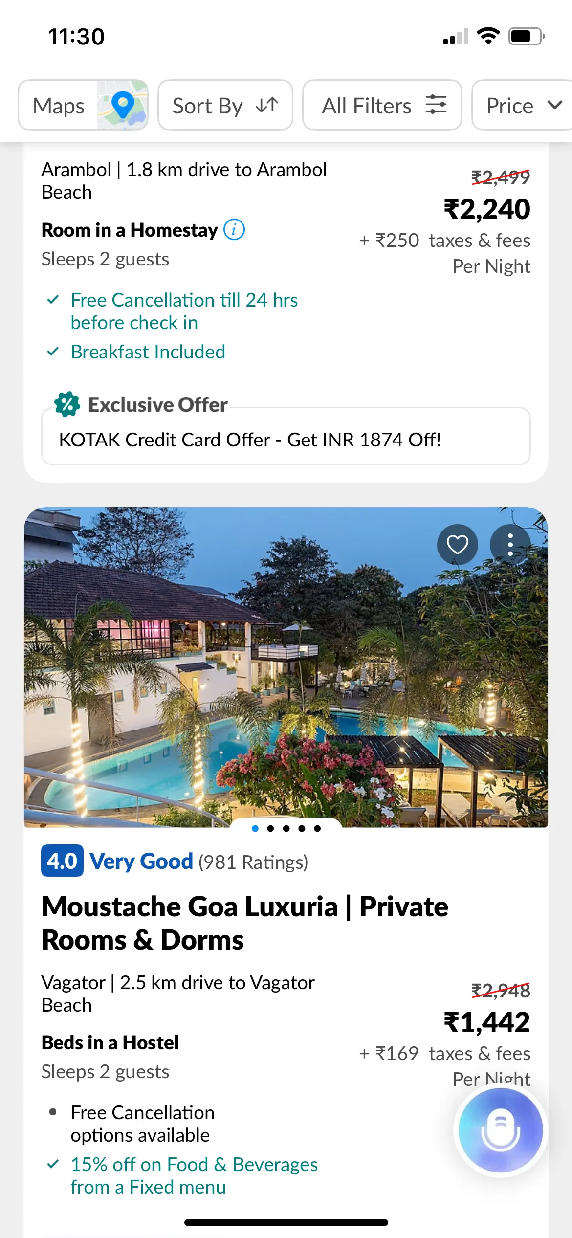
Each hotel result card includes:
- Image slider
- Hotel name & ratings
- Two-column layout:
- Column 1: Per-night pricing (incl. taxes)
- Column 2: Location, inclusions, cancellation info
What works well
- Good balance between visual appeal and information density
- Cards are not cluttered
- ~1.5 cards per screen encourages comparison while maintaining scroll efficiency
- Search summary collapses on scroll, preserving screen real estate
Improvement opportunity
Issue 1: Missing property highlights
The result cards lack key amenity and feature highlights (e.g., good for families, business-friendly, etc.).
This forces users to:
- Open more hotel detail pages
- Increase bounce between discovery and detail views
Issue 2: White space inefficiency
Due to the two-column layout:
- Cards often show unused white space, especially when text content is limited
Competitive comparison
Agoda: Solves white space using portrait-oriented images in one column and text in another, but compromises visual appeal through images that don’t capture property aesthetics properly.
Goibibo: Better balance—similar layout to MMT but:
- Less white space
- More feature highlights
- Still visually clean
Goibibo demonstrates that MMT’s layout can be improved without sacrificing aesthetics.
4. Pricing Presentation & Cognitive Load
Prices are displayed as: “Per night (including taxes)”
While per-night pricing is standard in hospitality:
- Users must mentally calculate total stay cost
- This is especially taxing for longer stays and group travel (>4 pax)
Improvement opportunity
Introduce a pricing toggle: Per night ↔ Total stay
This:
- Adds transparency
- Reduces cognitive load
- Makes better use of existing white space
Trade-off assessment
Slight UI complexity
Significant clarity and trust gain
5. Location-Based Discovery & Map Interaction
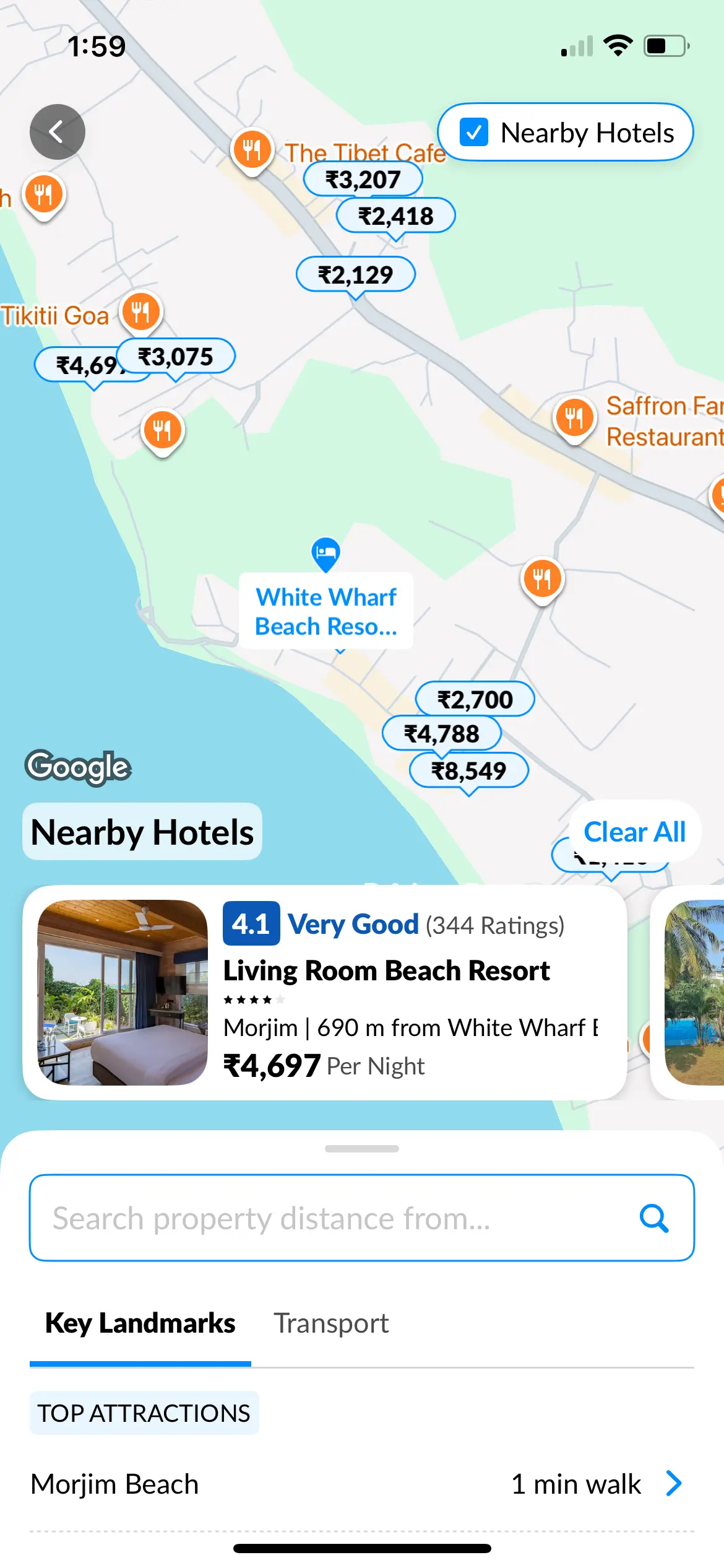
Users can view nearby hotels (500–1000m) from a selected property.
However, moving the map does not dynamically update hotel results.
Why this matters in travel UX is because location preference is often hyper-local.
Examples-
- Goa → proximity to beach
- Shimla / Mussoorie / Nainital → Mall Road
- Business travel → commercial locality
Improvement opportunity
A dynamic map-driven discovery (browse map → see updated inventory + estimated prices) would:
- Better match real decision behavior
- Reduce repeated back-and-forth searches
Agoda’s map-first search is a strong reference here.
6. Thoughtful Micro-Features That Add Value
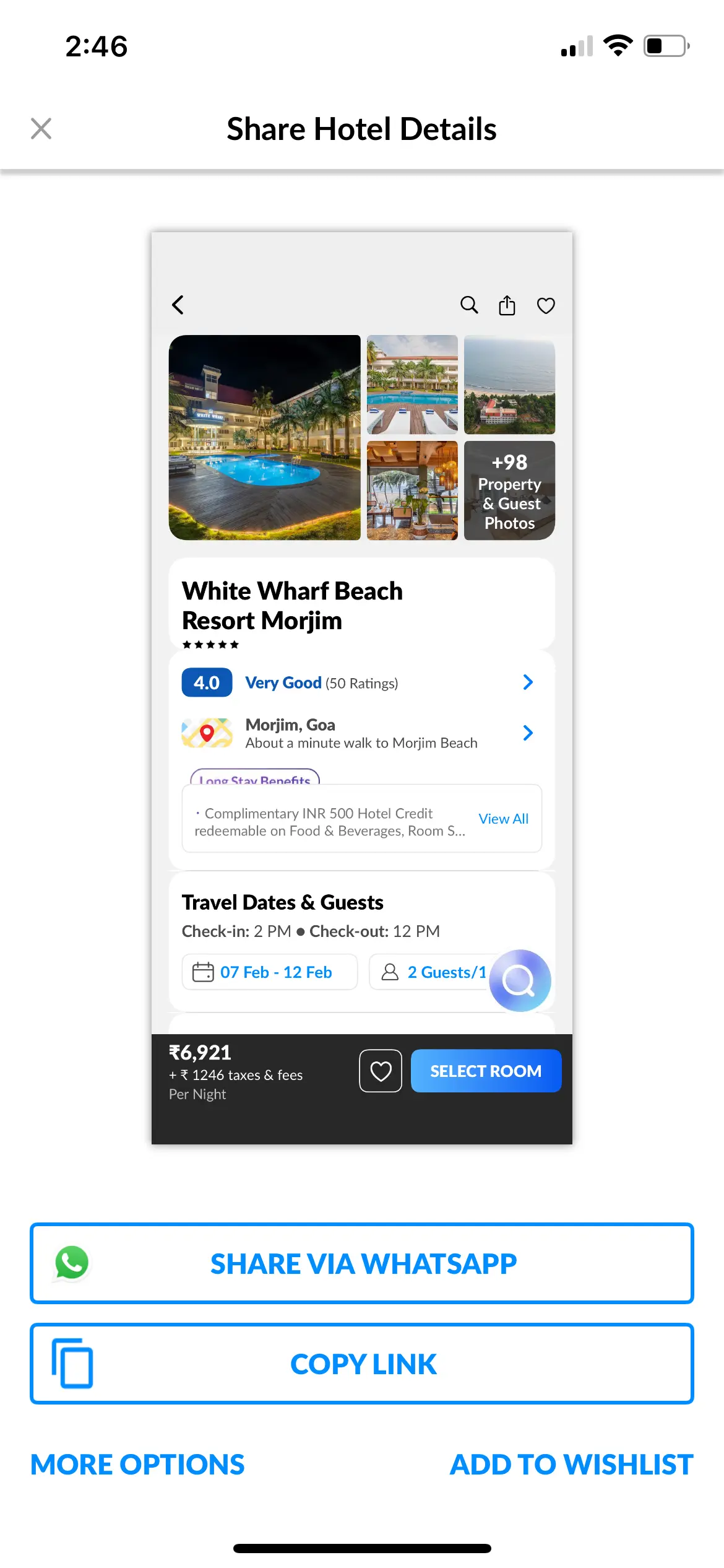
i. Screenshot-based sharing (Strong insight)
MMT detects when a user takes a screenshot of a hotel page and offers: “Share via WhatsApp”
Instead of sharing the image, it shares the hotel link.
This is a subtle but powerful example of:
- Observing real user behavior
- Designing for less tech-savvy users
- Reducing friction in group decision-making (very common in travel)
ii. “Tips” Feature (Contextual Value Add)
On the search results page, the Tips CTA opens a concise travel guide:
- Local transport
- Events
- Attractions
- Food & souvenirs
- Best time to visit
- Things to know before travel
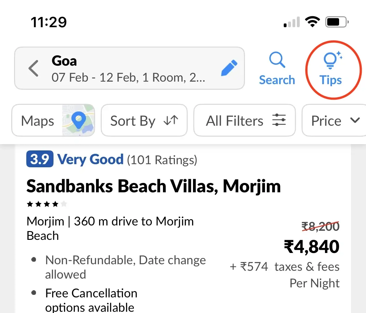
This enhances:
- Confidence in destination choice
- Time spent in discovery without derailing the booking flow
7. New Feature Recommendation
i. Collaborative Discovery & Decision-Making
Travel planning—especially hotels—rarely happens in isolation.
In real-world behavior, decisions are often made by groups of friends, families, work teams, etc.
These groups frequently involve multiple pax contributing to search, comparison, and final approval, but current travel apps—including MMT—still treat hotel discovery as a single-user journey.
Feature concept: Collaborative Hotel Discovery
MMT can introduce group-based collaboration within hotel discovery by allowing users to:
- Create a travel group for a trip
- Invite other users via link / WhatsApp
- Share a common search context (location, dates, pax)
- Collaboratively:
- Apply filters
- Shortlist properties
- Add comments or notes on hotels
- Vote or react on shortlisted options
- Chat within the group
This mirrors proven behavior patterns seen in Zomato and Swiggy’s group cart features, but applied earlier in the travel journey—at discovery and comparison, not just at checkout.
Product value addition
- Reduces out-of-app coordination (WhatsApp screenshots, links, confusion)
- Speeds up group consensus
- Keeps the entire decision funnel inside MMT
Trade-offs introduced
Added complexity due to need of clearly distinguishing solo vs collaborative modes. This is to handle use cases where a user is part of a collaborative group and wants to plan another trip independently.
This can be managed by:
- Making collaboration opt-in
- Activating it only when users choose “Plan with others”
ii. Quick Tutorial
MMT does not provide a guided post-install tutorial highlighting features such as Filters, Price sorting, Map view, Tips, Sharing, etc. Also, if it were to implement the ‘Collaborative Discovery & Decision-Making’ feature, which is new to MMT and its competitor applications, it certainly would have to factor in the learning curve.
Feature concept: A lightweight, time-delayed tutorial (after ~30 seconds of usage):
- 4–5 contextual popups pointing to key CTAs
- Improves feature discoverability without overwhelming
Agoda executes this particularly well.
Product value addition
- Feature discoverability without overwhelming new users
- Progressive learning aligned with real user intent
Final Verdict
Flow Coherence
7 / 10
Friction vs Value Balance
6.5 / 10
Feature Craft
6 / 10
Performance Perception
8.5 / 10
MakeMyTrip’s hotel booking experience reflects a mature, feature-rich travel product with strong fundamentals in discovery and clarity. The app demonstrates good intent modeling, especially in micro-features like screenshot-based sharing and contextual travel tips.
However, the experience can be significantly elevated by:
- Making user intent visible earlier in the journey
- Reducing cognitive effort in pricing and location-based discovery
- Improving personalization at the entry point
Overall, MMT shows strong execution depth, but still has room to sharpen focus, personalization, and intent-led UX, especially in high-competition discovery flows.