Swiggy — Food Ordering Experience
Platform evaluated:
Mobile app
Persona assumed:
Hungry, repeat user during peak hours
Journey evaluated:
Food ordering (not browsing other Swiggy services)
1. Entry Point & First Interaction (Landing Experience)
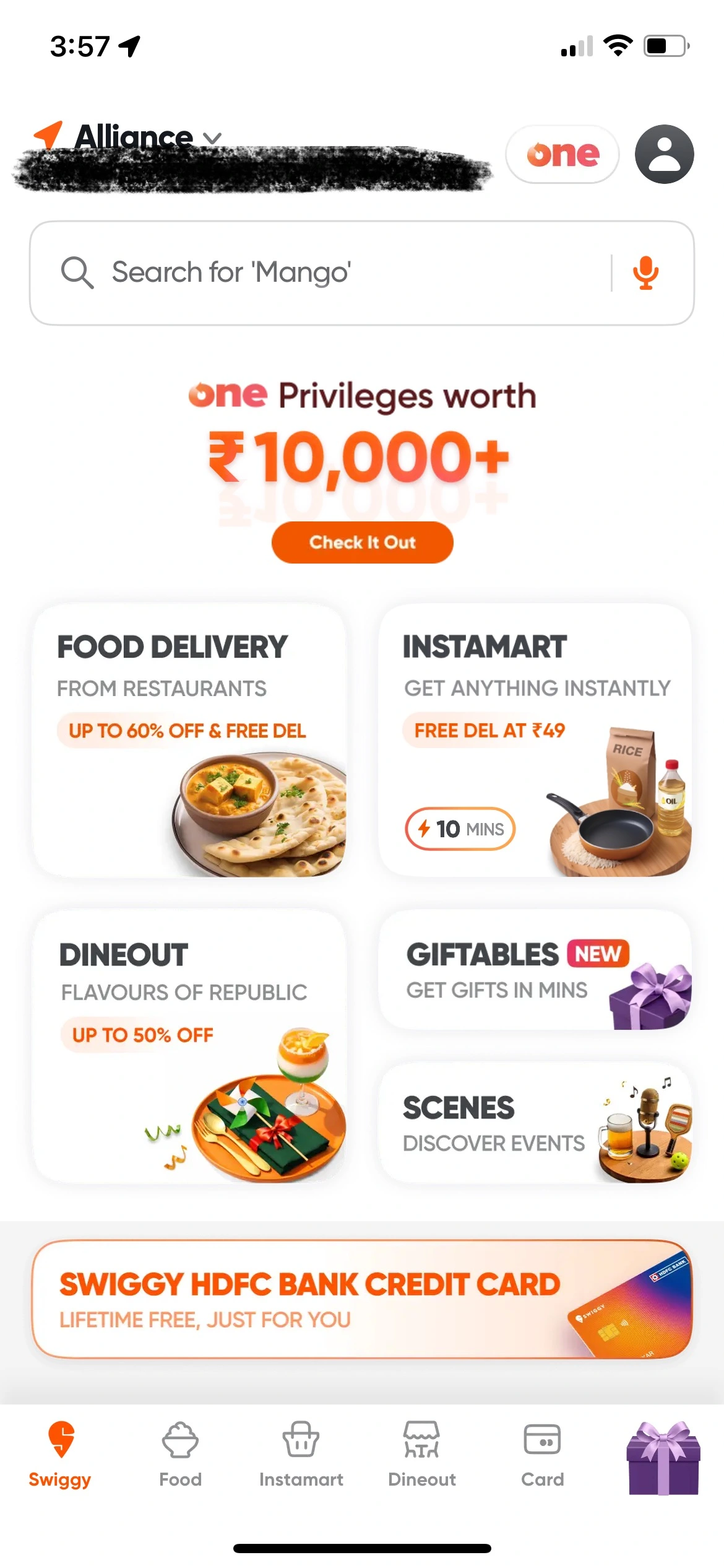
When the app opens, the landing page presents multiple service options such as Food Delivery, Dineout, Instamart, Giftables, and Scenes. Promotional popups occasionally appear, such as Instamart gift cards.
Product critique
Swiggy’s brand is strongly associated with food delivery, yet the landing experience introduces additional taps before users can reach restaurant discovery. Promotional popups further delay the core journey.
Interpretation
This is a cross-sell-first entry design rather than a food-first entry design. The product optimizes ecosystem exposure at the cost of time-to-first-action.
Trade-off observed
Ecosystem discovery > efficiency of core user flow
2. Restaurant Menu Design & Information Density
What works well
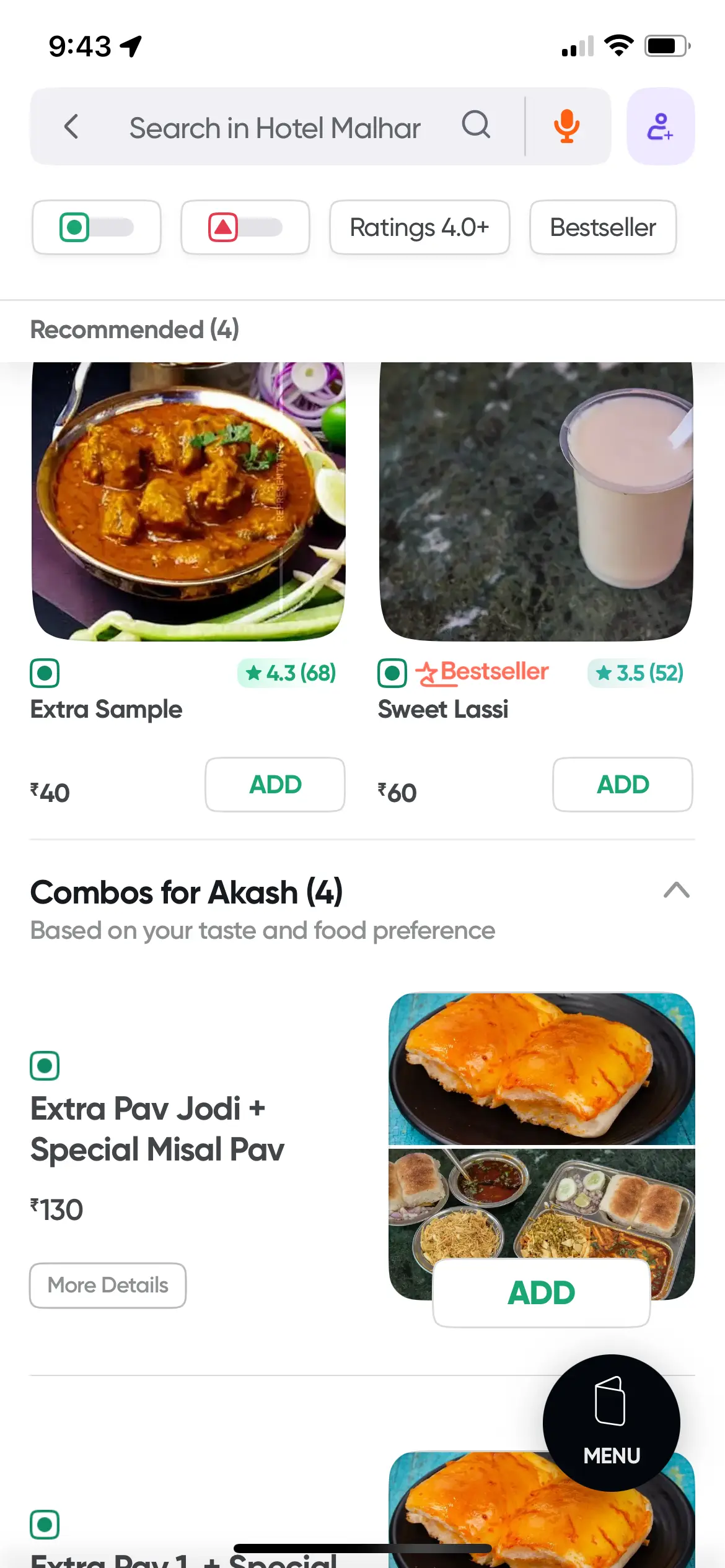
- Two-column grids increase items visible per screen
- Larger food images are visually appetizing
- Dish name + image usually suffice for decision-making
Compared to Zomato’s single-column layout with description previews, Swiggy’s approach preserves vertical space without increasing taps.
Improvement opportunity
Swiggy lacks quick visual cues for spiciness. Zomato’s chili icons instantly communicate heat levels.
Trade-off observed
Swiggy optimizes for visual appeal and scanning speed but omits at-a-glance descriptors. This trade-off is largely justified because imagery often makes descriptions redundant.
3. Preference Persistence Across Restaurants
Veg / Non-veg filters reset when users move between restaurants. Zomato persists this preference across the session.
Product critique
Users have already expressed a clear session-level preference. Resetting it introduces repeated, avoidable friction and signals page-level rather than session-level state handling.
Trade-off observed
Local simplicity is prioritized over cross-flow continuity.
4. Performance & Perceived Latency
During peak hours:
- Restaurant page load: ~3–7 seconds
- Returning to lists: ~5–8 seconds
Zomato typically loads comparable views in ~1–2 seconds under similar conditions.
Product critique
Food ordering is time-sensitive and emotionally driven. Latency compounds across exploration steps and sharply impacts user patience.
Trade-off observed
Data freshness correctness is prioritized over perceived responsiveness, resulting in user-visible slowness during peak demand.
Final Verdict
Flow Coherence
7.5 / 10
Friction vs Value Balance
7 / 10
Feature Craft
8 / 10
Performance Perception
6 / 10
Swiggy is a feature-rich, visually strong product that performs exceptionally well once users are deep in familiar flows. However, entry friction, state resets, and peak-hour latency surface precisely when patience is lowest.
The product reflects PM decisions optimized for ecosystem expansion, visual engagement, and operational correctness, but would benefit from sharper focus on session-level intent, perceived speed, and reducing repeated micro-frictions.